The Ongoing Modernisation of Insurance Buffalo

The Ongoing Modernisation of Insurance Buffalo
Insurance Buffalo has been evolving for years.
As the platform has grown, so has the way people use it. New functionality has been added, existing workflows have been refined, and the system has gradually developed into the product it is today.
That kind of organic growth is valuable. It means the software evolves around real requirements and real users.
But it also means that, over time, parts of the interface can become less consistent, more complicated or simply feel older than they should.
That's why we've started a broader effort to modernise the Insurance Buffalo user experience.
The goal isn't to rebuild the application from scratch.
It's to take a system that already works and make it easier to understand, easier to navigate and more pleasant to use.
A cleaner main navigation on mobile
The main toolbar is one of the most visible parts of Insurance Buffalo, and it was one of the areas that needed attention.
The previous dropdown-based navigation on mobile devices had served us well, but as the application grew it had become somewhat clunky and increasingly difficult to organise.
The new navigation uses an off-canvas menu, giving us more flexibility in how we structure the application's functionality.
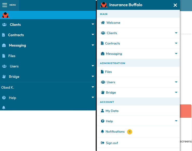
We've also reorganised the navigation itself.
Primary and secondary items are now more clearly distinguished, some related entries have been grouped into submenus, and Help-related functionality has been moved out of the account menu into its own dedicated area.
The result is a navigation structure that should be easier to understand as the product continues to grow.
A calmer approach to forms
Forms are another important part of the Insurance Buffalo experience.
The previous form design used stronger borders and visual framing. While functional, this could make information-heavy pages look quite busy.
We've started moving towards a lighter visual language.
Forms now make greater use of whitespace, subtle shadows and less prominent boundaries. Buttons and other controls are becoming more rounded, and the overall layout is gradually moving towards a more modern appearance.
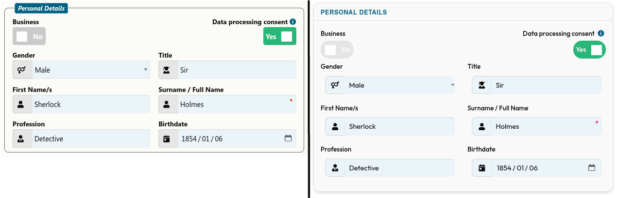
The intention is not simply to make forms look nicer.
A calmer visual structure makes it easier to scan a page and identify the information or action that matters.
Because familiar interfaces matter to existing users, we have also retained a setting that allows users who prefer the previous form design to switch back.
Modernisation should improve the experience without unnecessarily disrupting the people already using the product.
Making important information stand out
Another focus has been information hierarchy.
Insurance Buffalo often contains a lot of information on a single screen. The challenge is not only presenting that information, but making the important parts immediately visible.
We've introduced information pills in several areas of the application to help with this.
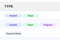
For example, the client overview now makes the client type immediately distinguishable using pills.
On client detail pages, important client information is highlighted in the same way, allowing users to get a quick understanding of the client without having to work through every field on the page.
These are small interface elements, but they help create a more structured and scannable experience.
Notifications with more useful information
We've also made notifications considerably more detailed.
Previously, some notifications provided only a basic message that something had happened.
That wasn't always enough.
A notification should ideally answer the next question a user is likely to have.
For example, when a contract expiry notification is triggered, users can now see exactly which contracts caused the notification rather than receiving only a generic warning.
We've also added email notifications, giving users more flexibility in how they receive important information.
This is part of a broader principle we're applying across the interface: wherever possible, information should be useful immediately rather than requiring the user to investigate further.
Improving the overall visual experience

The navigation, forms and notifications are the most visible parts of this work, but they're not the only changes.
We've also been gradually refining smaller elements throughout the application.
Buttons are becoming more rounded. The footer is less visually prominent while still providing the same essential information. Spacing and whitespace are being improved. The overall layout is gradually becoming more consistent.


None of these changes is particularly revolutionary on its own.
Together, however, they move Insurance Buffalo towards a more coherent and modern interface.
The original design was created around seven years ago. A lot has changed since then — not only in web design, but also in expectations around how software should present information.
Why we're doing this now
There are two sides to this work.
The first is the user experience.
We want brokers and financial managers to be able to work through the system efficiently, quickly understand what's on screen and spend less mental effort dealing with the interface itself.
The second is the continued development of the product.
Insurance Buffalo is a SaaS platform. That means we don't see development as something that ends when the core product is complete.
The product should continue to improve as we learn more, as customer expectations change and as we identify better ways of solving existing problems.
That doesn't mean adding features simply to have something new to announce.
It means maintaining the product, fixing the small things that get in the way, improving existing functionality and continuing to make the experience better.
The recent interface work has therefore gone hand in hand with minor bug fixes and other smaller improvements.
Why we're taking an incremental approach
We could have approached this as a complete redesign and changed everything at once.
We chose not to.
Existing users already know Insurance Buffalo. They have established workflows and habits, and those are valuable.
A sudden, sweeping redesign might look impressive, but it could also force experienced users to relearn parts of the system that already work for them.
Instead, we're introducing improvements gradually.
This allows us to modernise the product while keeping the underlying experience familiar.
It also gives us the opportunity to learn from each change and carry those lessons into the next one.
More improvements are coming
This isn't the end of the modernisation effort.
There are still areas we want to improve, including mobile readability and onboarding. Some information can be presented more effectively on smaller screens, and we're continuing to work on making it easier for new users to get comfortable with the system.
There are also plenty of smaller details across the application that can be polished further.
That's intentional.
We don't see the modernisation of Insurance Buffalo as a one-time project with a finish line. We see it as an ongoing part of developing the product.
A better experience, one improvement at a time
Insurance Buffalo has grown organically over the years, and that growth has created a strong foundation.
Now we're putting more attention into the experience around that foundation.
Cleaner navigation. Less visual clutter. More informative notifications. Better information hierarchy. A more modern visual language.
Not because the old system was unusable.
Because we believe a product that's already useful can still become significantly better.
And that's what we're working towards: an Insurance Buffalo that feels easier, clearer and more modern every time you use it — without losing the familiarity that existing users depend on.
The work continues.
Your  Insurance Buffalo Team
Further Information
We value your input and strive to meet your needs.
Take advantage of our free trial offer today to experience our solution for yourself.
No credit card required.
No automatic subscription.
See how our platform can help your business grow.
For additional information, please refer to the following pages:
Frequently Asked Questions
Features of Insurance Buffalo